What Are The Top Techniques For Responsive Web Design?

Do you want to purchase a product? Or are you looking for some information? Long gone are the days when one had to open their PC or laptop to just look for a product. With smartphones in hand, you can get what you want with just a few clicks. It isn’t a feasible option to carry your laptops everywhere. Or, is it?
Using a smartphone is a more compatible and easier option. But, imagine that on visiting the site, you find the content and design distorted. You have to scroll up and down, just to navigate for a single product. This doesn’t sound very appealing.
This is where the role of a responsive web design comes into play. But, what are its benefits? Should we hire a professional to get this done?
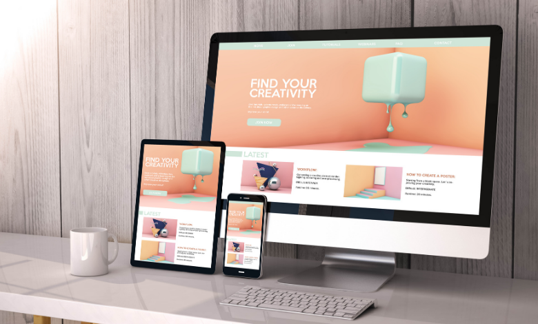
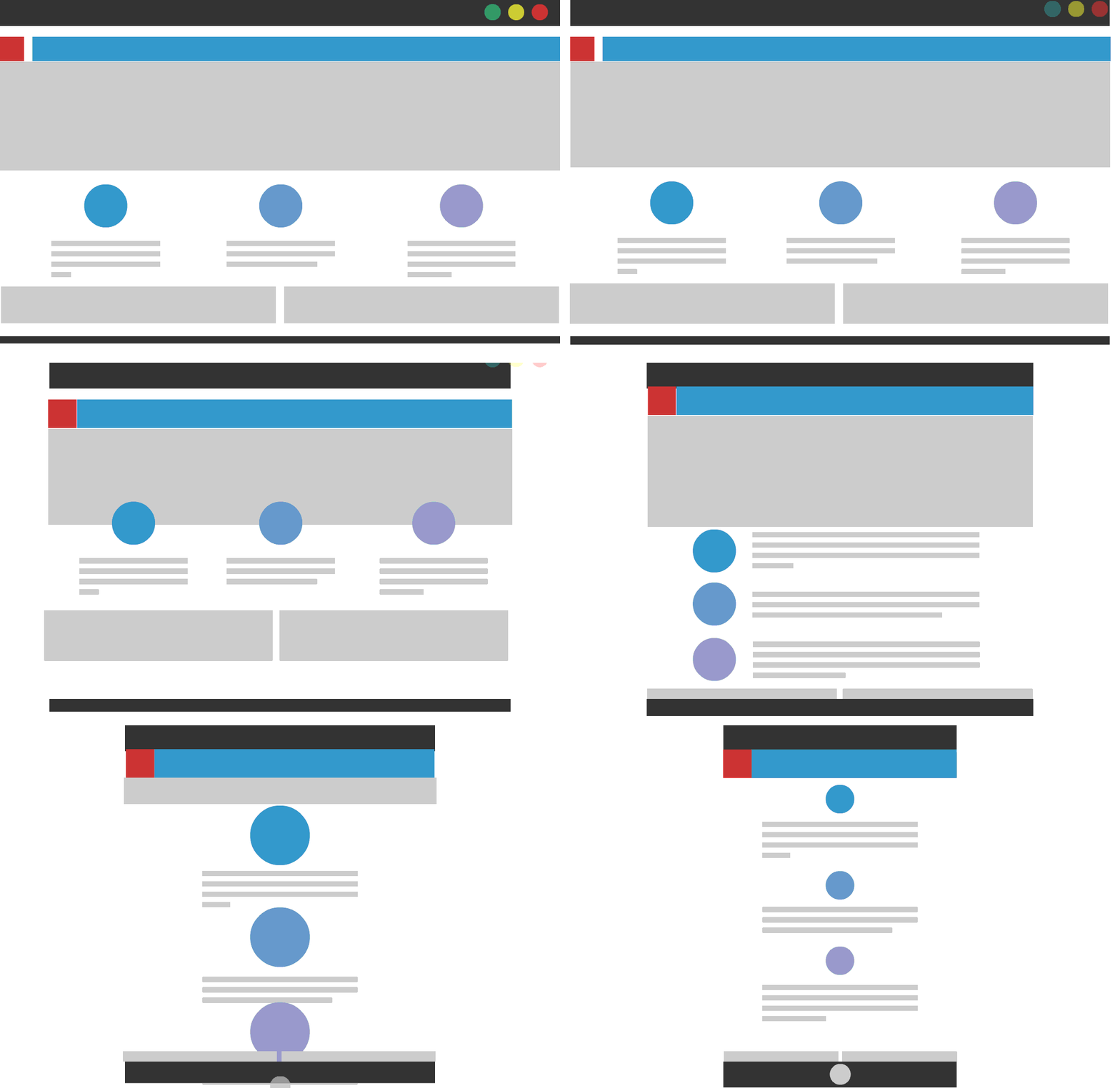
A responsive web design is basically designed as an approach for designing and coding the site in a way that it fits the size of the screen properly. Whether it be a 6-inch screen or a 40-inch display, it should be compatible with all. It isn’t feasible to create a separate design for every device. That surely is a never-ending task and a highly costly affair.
To get the best results, it is a good idea to hire responsive web services in Mississauga, ON. We at CS Solutions, are a website development company in Mississauga, ON provides you with optimum website solutions helping you create a remarkable presence in the virtual space.
Let us walk you through some of the techniques which you can incorporate to create a smart and responsive web design.
Techniques for an ideal and responsive web design
Before knowing the techniques, one must essentially know the benefits of availing the web design services in Mississauga, ON. Along with an optimal viewing experience, a responsive web site has the following advantages:
- Attracts more audience on the site and increases traffic
- Improves SEO and ranks the site higher on the results page
- Decreased bounce rates
- Increases brand’s credibility
Here are some of the techniques to help your brand grow by leaps and bounds.
Help the users achieve their objective:
A user visits the site with a defined purpose. The main goal of responsive design is to provide a good user experience. The foremost point to consider is eliminating friction, which leads to a reduction in process speed. For e.g., if you have a mobile site for an e-commerce platform, you can make a one-step checkout instead of multiple steps. This will allow the users to instantly place an order with much hesitation.
Understand the goals of your target audience and ensure that their purpose is fulfilled.
Create the design according to hand movements:
Unlike desktops, where users can navigate through the complete screen space, phones have a smaller region for interaction. On mobiles, users mainly work through swipes and taps. This makes it crucial to make the UI design according to the thumb space so that they can reach the elements on the screen comfortably.
A good tip is to keep the placement of the navigation button at the bottom. Add the interactive elements in the centre of the screen. Also, maintain the right height of CTA’s and essential links.
Put the native hardware of mobile devices to the best use:
When incorporating a responsive web design, ensure that it works well with the device’s capabilities. Cameras should be accessible easily. The users must be able to share the pictures from the site across social media platforms. Enable voice search and other such optimizations.
You can avail yourself of web design services in Mississauga to meet all your requirements for the site and provide a good user experience to the audience.
Make fluid layouts:
What does this mean? All devices have different sizes and different breakpoints on the screen. This makes it crucial to provide a seamlessly fluid and adaptive user experience for the content flow. With responsive web design, you can ensure that the elements adapt to the screen size easily. When designing them, you can even set the minimum and maximum width to avoid any compromise with the quality.

We provide you with prime responsive web design services in Mississauga, ON, and create the site as you expect it to be.
Landscape orientation:
The users can also view the site in landscape orientation. So, when adjusting the viewpoint for landscape, provide the option of navigating through two fingers. You can even allow scrolling of elements with left and right sliders. This makes the site easily usable and accessible.
The professionals at our website development company in Mississauga, ON, take note of all these factors to provide you with a well-optimized site.
Also read: Web Design or Development: What is the Best?
Opt for conditional loading:
Even after all the technological advances, there are instances where some website elements cannot be loaded on the phone. So, to eliminate the excessive cognitive load, you can hide some elements on the site for a phone. This will increase the page performance and provide a smooth experience to the users.
It is always to go for responsive web design services in Mississauga, ON, as the designers and coders have good knowledge about the website specifications, helping you put the best for the users.
We at CS Web Solutions, are a Mississauga web design company. You can choose us for all your web design services in Mississauga, ON, and expect nothing but the best in return.
Conclusion:
If you haven’t shifted your website and made a responsive web design yet, it is high time you do that. After all, the users use their smartphones to browse the web. So, if you want to take your business a step further, this is it!


